Posters that can be read from across the street
Posters that can be read from across the street
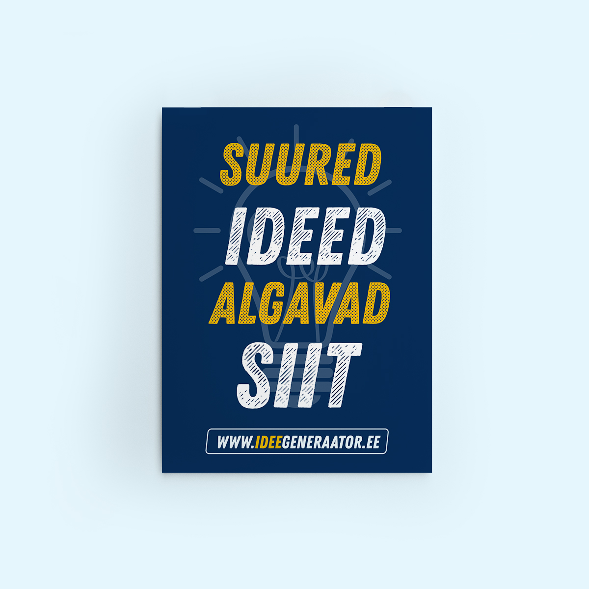
Have you ever noticed a poster that was pretty but nothing more? You could not say why it was there or who it was for. In advertising, a poster has only a fraction of a second to win a passer-by’s attention. This article explains how to design a poster that catches the eye – so that people stop and actually read it. We cover how to make a poster readable from a distance, which print technology to choose and how to make sure your event poster survives harsh northern weather.
The golden rule: letter height versus viewing distance
A poster’s worst enemy is text that is too small. Designers often make the mistake of judging the design close up on a screen, forgetting that a poster on the street has to be readable from 5, 10 or even 20 metres.
The rule of thumb is simple: for every 3 metres of viewing distance, the letter height should be at least 1 cm.
- 3 metres: letter height at least 1 cm (indoors, for example on a shop wall).
- 10 metres: letter height at least 3.5 cm (pavement advertising stands).
- 25 metres: letter height at least 9 cm (larger posters read from across the street or from a car).
Font choice matters as well as height. On posters, prefer clear sans-serif fonts (Helvetica, Arial, Montserrat). Thin typefaces and those with serifs tend to blur together when seen from a distance.
Contrast – your secret weapon for attention
The most readable text is text that stands out clearly from the background. The best contrasts are:
- Black text on a yellow background (the human eye reacts to this combination fastest).
- Black text on a white background.
- White text on a dark blue or black background.
Avoid combining tones of similar brightness (red text on a green background, for example): it may look striking on screen, but from a distance it turns into a grey mass.
Choosing the right material: from paper to PVC
The technical execution is the printer’s job; what matters most for you is choosing the right material and finish for where the poster will hang.
1. Paper posters
The most affordable option for indoor use, notice boards and short-term advertising. Paper reacts to moisture by wrinkling, and long exposure to sunlight fades the colours. But if you put a midsummer party poster on a shop door two weeks before the event, paper is entirely sufficient. The standard paper choices at print shops are silk, gloss or uncoated. Silk and gloss differ in sheen and are generally more resistant to moisture. Uncoated paper is matt and reacts to moisture faster.
2. Laminated posters
Lamination adds a thin film to the paper that protects the print from UV light, moisture and mechanical damage.
- Gloss laminate: makes colours brighter and deeper, but can cause reflections that make text unreadable in direct light.
- Matt laminate: avoids reflections and looks solid; the best choice where there is strong artificial lighting.
3. PVC posters and banners
If the poster has to survive harsh weather for a long time, PVC is the only right choice. It is waterproof and tear-resistant and needs no lamination to last outdoors. A thickness of 4–5 mm is recommended.
Weather and light – how to protect a poster
If the poster goes outdoors, the materials have to be durable.
- UV light: direct sun can fade printing inks within a few weeks. For longer outdoor advertising, ask for UV-resistant inks or lamination.
- Moisture and rain: paper absorbs water. If the poster will be exposed to moisture, choose lamination or a waterproof synthetic material.
- Light and reflection: if the poster sits behind glass or in a strong spotlight, choose matt laminate. A gloss surface creates reflections that make the text unreadable.
Pre-press checklist
Before sending your files to the Pajoprint team, run through this quick check:
- Resolution: is the file at least 300 dpi? (For large posters 150 dpi can be enough when the viewing distance is long.)
- Colour space: is the file in CMYK? Images on the web are mostly RGB, which is not the best choice for print. RGB designs always print darker than they look on screen.
- Bleed: is there 3 mm bleed on every edge? When posters are trimmed, the cut can shift by 1–2 mm.
- Safe area: is all important text at least 10 mm from the edge? Avoid frames in the design: if the cut shifts slightly, a frame that is not perfectly centred looks disturbing.
Mounting tips: how to avoid folds and creases
Even the best print loses its value if the poster hangs creased on the wall.
- Rolling: always store a poster rolled, never folded. Fold marks are almost impossible to remove later.
- Mounting: start fixing from the top corners and work smoothly from the centre towards the edges.
- Display sleeves: if you use advertising stands, make sure the sleeve is clean and taut. Moisture between the sleeve and the poster can ruin the paper.
Need help creating a poster that stands out? At Pajoprint we help you choose the right material and technology so that your message gets through – clearly and legibly. Smaller runs are ready in 2–3 working days, and we ship across Europe. Order your poster printing here.